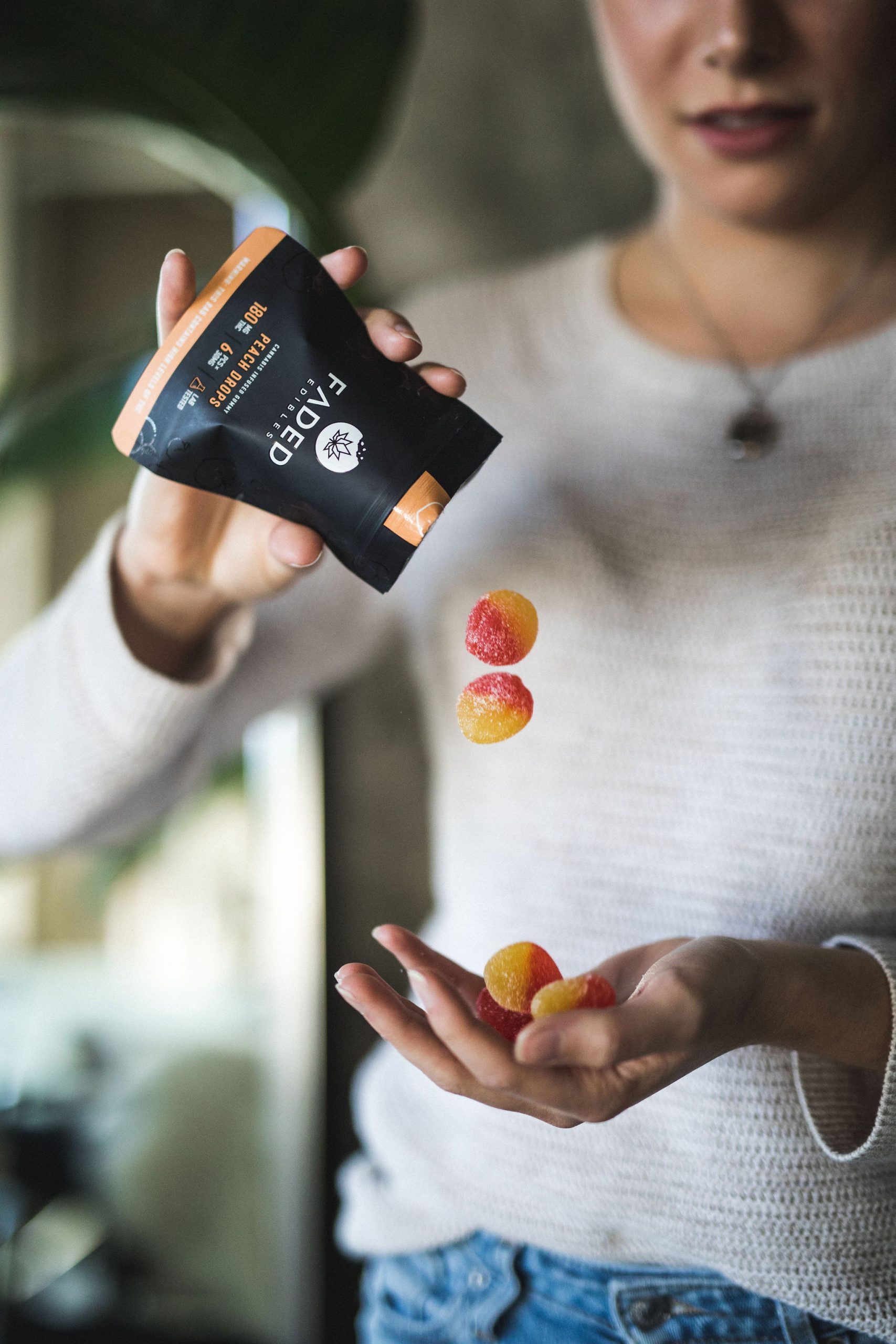


Bag Redesign
The initial bag design for Faded Edibles was printed on a matte-finish material with a white front-side and reversed black. To differentiate between the bags and flavors, I created additional labels to be stuck on the backside. After a couple of months, my client felt that it was time to redesign the bags so that each flavor has its own design and reached out to me again.
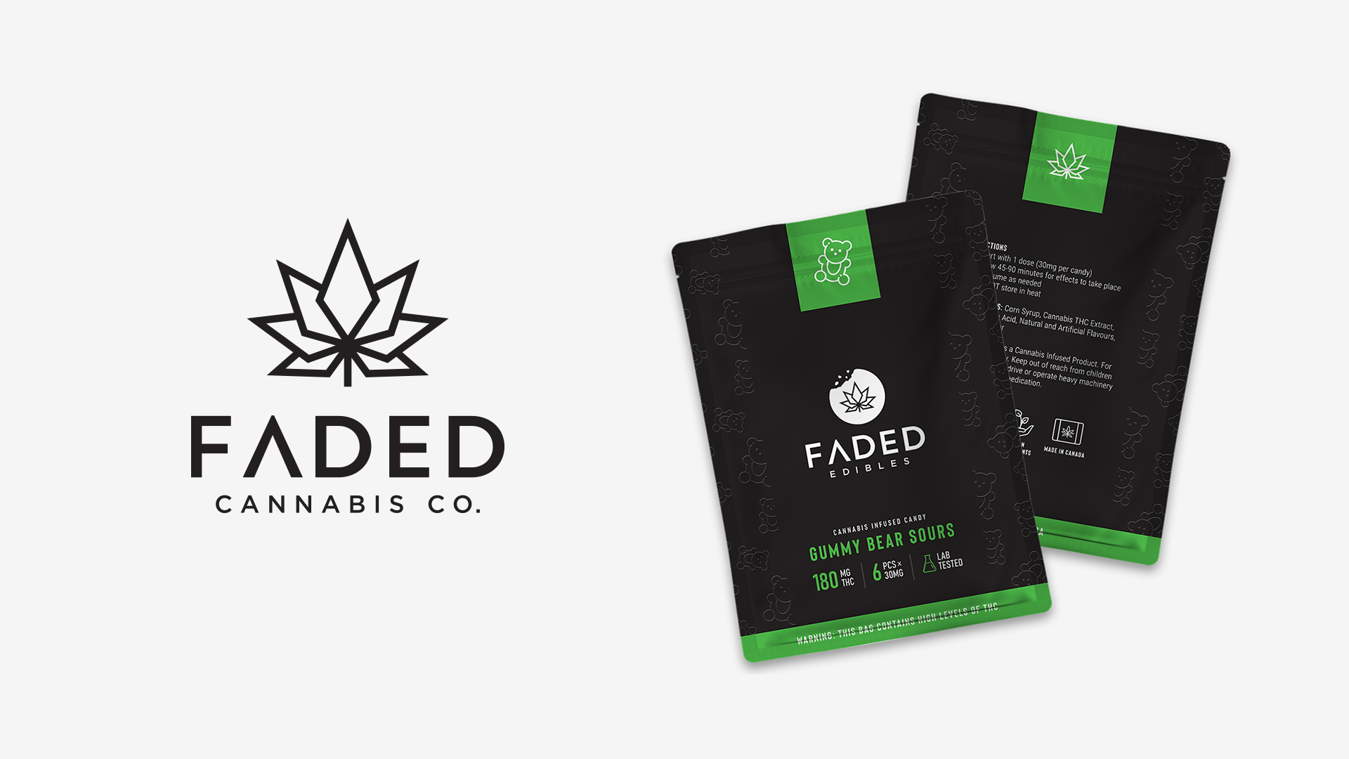
This time around I wanted to create a cohesive system with the design of the bag that would allow for a new flavor to be introduced with ease, yet remains consistent with everything else. The new design focuses on having an icon and one accent color to represent the flavor.
Original Bag Design

Bag Redesign